Part 4 – Spatial Join, Density & Statistics
Classification: Beginner GIS Analysis | Spatial Data Basics | Spatial Join, Density & Statistics
Learning Level: Beginner
Time Estimate: 90 minutes
Software Required: QGIS LTR 3.44, Excel (or Google Sheets)
Author: Daniele Cannatella
Overview
This exercise is the fourth hands-on block of the Week 1 GIS workshop, following on from Part 1 – Vector Import & Basemap. You will import a point layer of bus stops in Vlissingen, count how many fall within each neighbourhood using a spatial join, calculate bus stop density, compute descriptive statistics across all neighbourhoods, visualize the result as a choropleth, and build a bar chart from the same data in Excel.
Learning Outcomes
By completing this exercise, you will be able to:
✅ Import a point layer into QGIS and check it against an existing polygon layer
✅ Use a spatial join to count points within polygons (a zonal statistic — one count per neighbourhood “zone”)
✅ Calculate a density field (points per area)
✅ Compute and interpret basic descriptive statistics (mean, median, min/max) across neighbourhoods
✅ Style a quick choropleth map of counts or density
✅ Export attribute data as CSV and build a bar chart in Excel
Data & Software
Step 1: Import the Bus Stops Layer
- Launch QGIS LTR 3.44 and open the project
vlissingen.qgz - From the Browser Panel, import the point layer
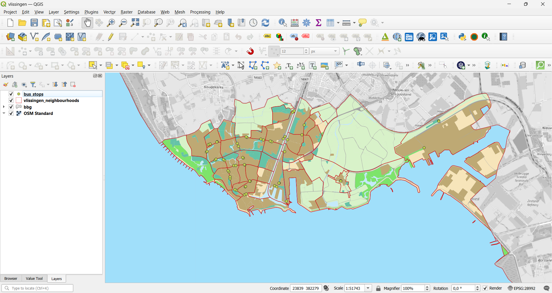
bus_stops.gpkg - Check that it draws correctly over Vlissingen, alongside
vlissingen_neighbourhoods
Result: Bus stops locations appear as points scattered across the neighbourhood boundaries.
Step 2: Count Bus stops per Neighbourhood
2.1 Join Attributes by Location (Summary)
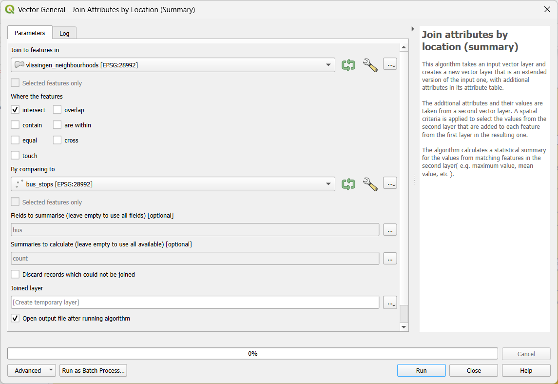
- Go to Processing → Toolbox → Vector general → Join Attributes by Location (Summary)
- Configure the join:
- Join to features in:
vlissingen_neighbourhoods - By comparing to:
bus_stops - Where the features: intersect
- Fields to summarise: check only bus
- Summaries to calculate: check only count
- Join to features in:
- Run the tool
Result: A new layer is created (e.g. Joined layer) with one row per neighbourhood and a new field holding the bus stop count for that neighbourhood.
- Rename the output layer
stops_per_neighbourhood
2.2 Replace NULL values
- Open the Attribute Table for
stops_per_neighbourhood, observe thebus_countcolumn
- Toggle editing mode
- Open Field Calculator
- Update existing field:
bus_count - Expression:
if ("bus_count" IS NULL, 0, "bus_count")if ("bus_count" IS NULL– sets a condition0– specifies what to do if the condition is true: which value to use as a replacement"bus_count"- specifies what to do if the condition is false (i.e. value is not NULL): keep the currentbus_countvalue
Result: The bus_count column is updated to replace NULL values by numberic values (zero).
2.3 Calculate Density
Raw counts favour large neighbourhoods, so add a density field to make the comparison fair.
- Open the Attribute Table for
stops_per_neighbourhood, toggle editing mode - Open Field Calculator
- Create a new field:
bus_stop_dens(type: Decimal number) - Expression:
"bus_count" / ($area / 1000000)"bus_count"– the bus stop count field created by the join (rename in the expression if your join used a different field name)$area / 1000000– converts the neighbourhood’s area from m² to km²- Dividing gives bus stops per km²
- Click OK, save your edits, and toggle editing off
Result: Each neighbourhood now has both a raw bus stop count and a density value.
Step 3: Descriptive Statistics
Before mapping or charting the data, get a feel for the numbers themselves — this is what turns a table of values into something you can interpret.
3.1 Open the Statistics Panel
- Select
stops_per_neighbourhoodin the Layers Panel - Go to View → Panels → Statistics Panel (enable it if not already visible)
- Set Field/Expression to
bus_stop_dens - Make sure Statistics on is set to the whole layer, not just a selection
Result: The panel lists summary statistics for bus_stop_dens across every neighbourhood — at minimum, note Count, Minimum, Maximum, Mean, and Median.

3.2 Interpret the Numbers
Write down the citywide mean bus stop density — you’ll use it in Step 6 to add a reference line to your bar chart.
Step 4: Visualize in QGIS
- Select
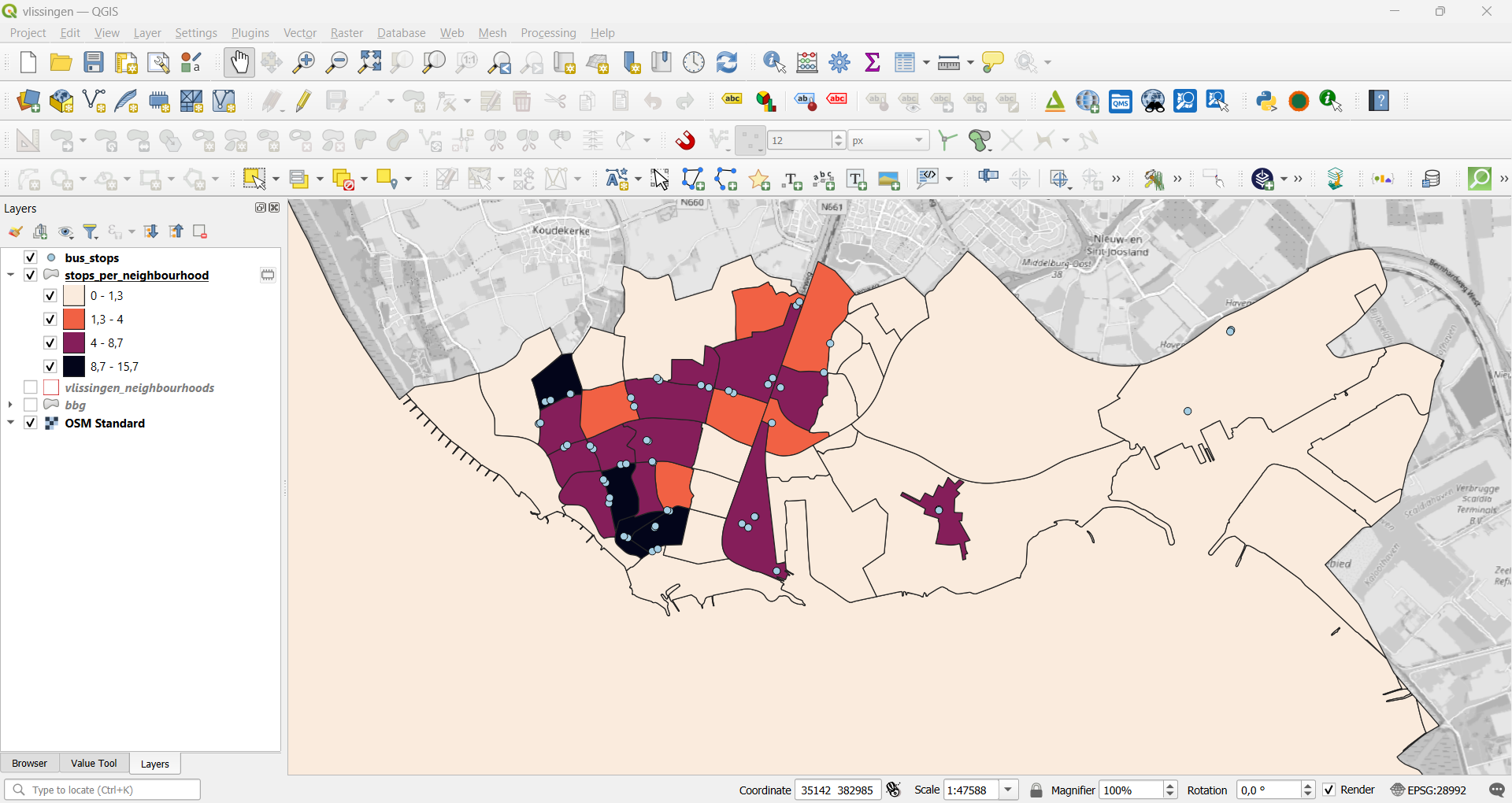
stops_per_neighbourhood, open Layer Styling (F7) - Change the classification type to Graduated
- Value:
bus_stop_dens - Classification Mode: Natural Breaks (Jenks), 4 classes
- Choose a sequential colour ramp and click Classify, then Apply
- Make sure the
bus_stopspoint layer is drawn on top, with small, visible markegit chers, so individual bus stops stay visible over the choropleth
Result: A choropleth of bus stop density per neighbourhood, with the underlying bus stop points still visible for reference.
Step 5: Export the Attribute Table as CSV
- Right-click
stops_per_neighbourhood→ Export → Save Features As… - Format: Comma Separated Value [CSV]
- File name:
stops_per_neighbourhood``.csv - Under Layer Options, set GEOMETRY to AS_XY or No geometry, so the CSV stays a plain table rather than embedding geometry text in every row
- Click OK
Result: A CSV file with one row per neighbourhood, including its name, bus stop count, and density.
Step 6: Build a Bar Chart in Excel or Google Sheets
- Open
stops_per_neighbourhood.csvin Excel (or import it into Google Sheets) - Select the neighbourhood name column and the
bus_stop_dens(or count) column - Insert a bar chart (or column chart) from the selection
- Sort the data by value first (largest to smallest) so the chart is easy to read
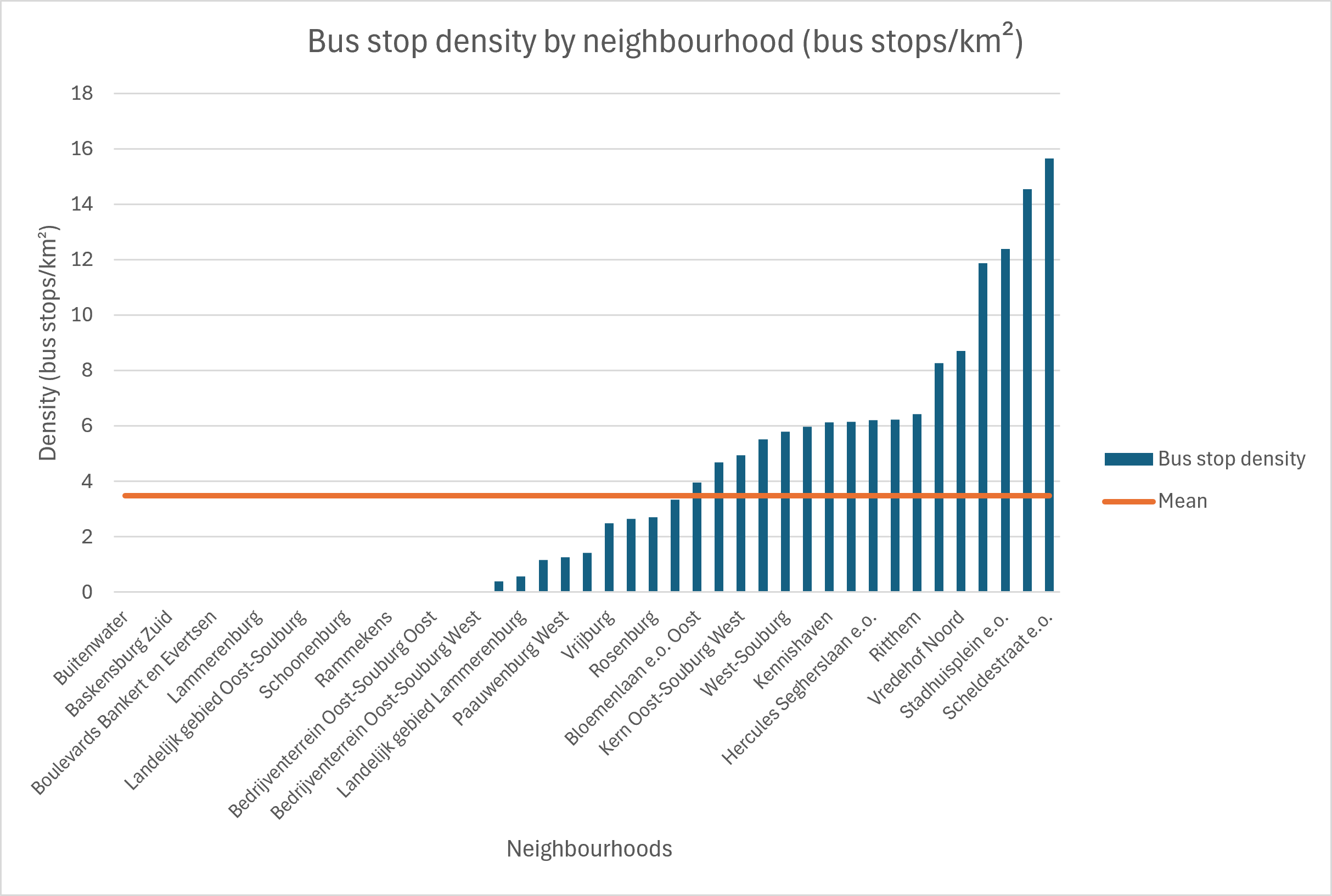
- Give the chart a title and label the axes (e.g. “Bus stop density by neighbourhood (bus stops/km²)”)
- Add a horizontal reference line at the citywide mean you noted in Step 3.2 (e.g. add a constant “Mean” column and plot it as a second series, or use a chart error-bar/trendline set to that value), so the chart shows at a glance which neighbourhoods sit above or below average
Result: A bar chart ranking Vlissingen’s neighbourhoods by bus stop density, with the citywide mean visible as a reference.
Reflection
- What does the raw bus stop-count map miss that the density map shows?
- Why might the mean and median density differ, and which one better describes a “typical” neighbourhood?
- How would the presence of NULL values affect these statistics and their interpretation?
- How do the choropleth map and the bar chart complement each other — what’s easier to read in each?
- What are the limitations of using crowdsourced OSM data to count amenities like bus stops?