Part 2 – Raster Import & Basemap
Classification: Beginner GIS Analysis | Spatial Data Basics | Raster Import
Learning Level: Beginner
Time Estimate: 30 minutes
Software Required: QGIS LTR 3.44
Author: Daniele Cannatella
Overview
This exercise is the second hands-on block of the Week 1 GIS workshop, following directly on from Part 1 – Vector Import & Basemap. You will import an AHN elevation raster for Vlissingen, inspect its values, style it as a basemap, and use a simple elevation threshold to derive a sea-level-risk zone.
Learning Outcomes
By completing this exercise, you will be able to:
✅ Import a raster layer into QGIS from the Browser Panel
✅ Read raster statistics (min/max) and interpret a histogram
✅ Style a raster using a pseudocolor ramp
✅ Derive a binary risk-zone raster using a threshold expression
✅ Export a raster layer and share a basemap screenshot
Data & Software
Step 1: Import the Raster Layer
- Launch QGIS LTR 3.44
- Open the project
vlissingen-part-2.qgz - From the Browser Panel, import the raster layer
elevation_5m.tif
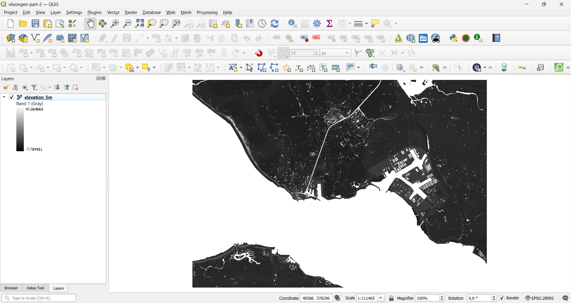
Result: The evelation_5m layer appears in the Layers Panel and draws on the canvas in a default greyscale style.
Step 2: Inspect Raster Statistics
2.1 Open Symbology and Set Accuracy
- Right-click the
elevation_5mlayer and select Properties - Go to the Symbology tab
- Under Min / Max Value Settings, set Accuracy to Actual (slower) instead of the default Estimate (faster)
2.2 Check Min, Max, and Histogram
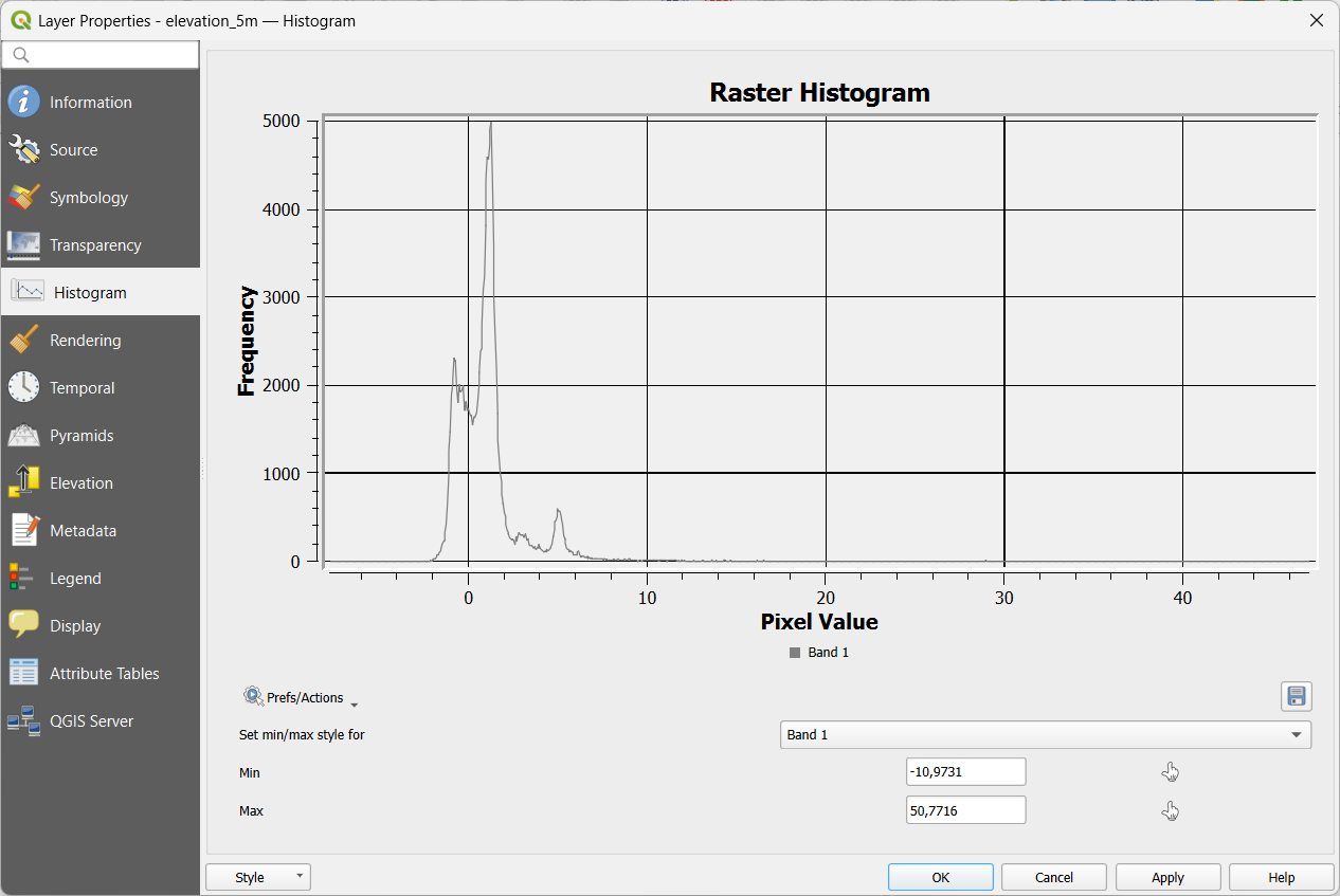
- With Accuracy: Actual applied, note the reported Min and Max values in the Symbology panel
- Switch to the Histogram tab (in the same Layer Properties dialog) to view the distribution of elevation values
Result: You should see a min/max elevation range for the study area, and a histogram showing how frequently each elevation value occurs.
Step 3: Style the Raster
- Still in Layer Properties → Symbology, change Render type to Singleband pseudocolor
- Choose an elevation-appropriate colour ramp from the cpt-city catalog: Color ramp → All Color Ramps/Create New Color Ramp… → cpt-city
- Click Classify, then Apply
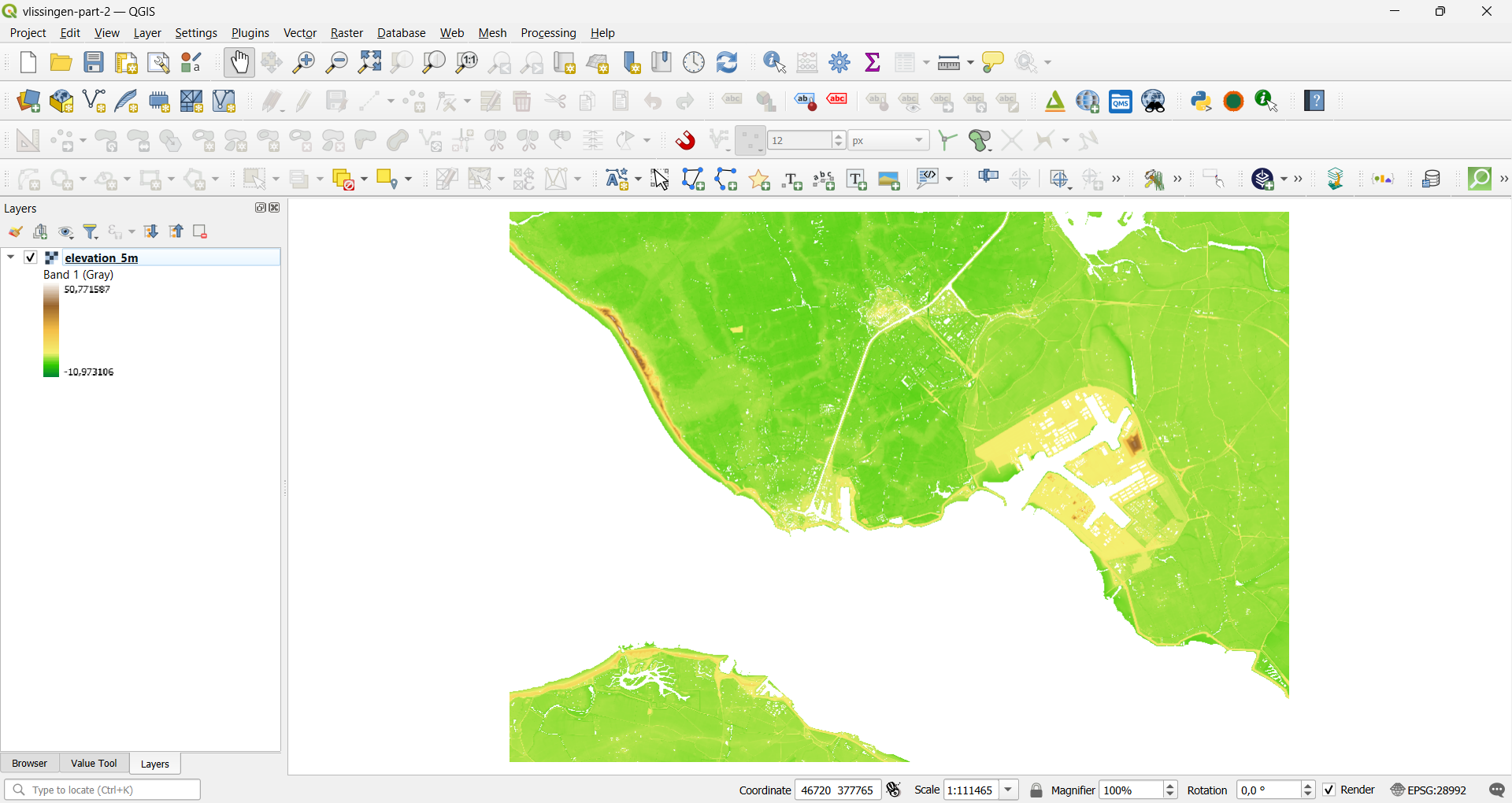
Result: The DTM now renders in a continuous colour ramp from low to high elevation, making terrain patterns easier to read than the default greyscale.
Step 4: Derive a Sea-Level-Risk Zone
Areas at or below the 0.70 m threshold are treated here as a simple proxy for land potentially exposed to projected 2100 sea-level rise.
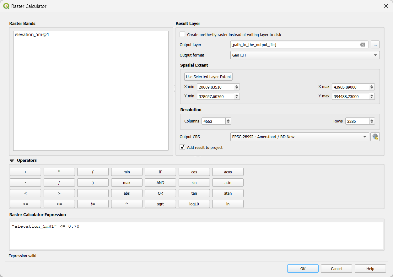
- Open the Raster Calculator (Raster → Raster Calculator…, or search Raster calculator in the Processing Toolbox)
- Output layer:
risk_zones.tif - Expression:
"elevation_5m@1" <= 0.70"elevation_5m@1"– refers to band 1 of the AHN DTM raster<= 0.70– flags every pixel at or below the 0.70 m threshold
- Click OK to run
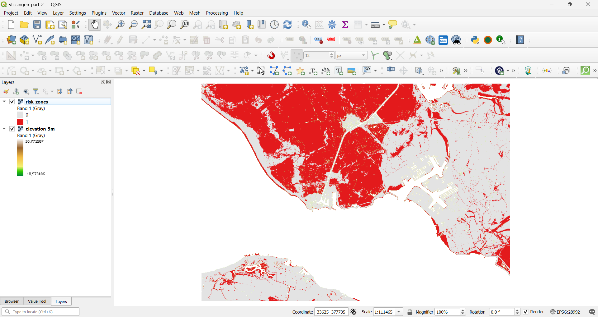
Result: A new binary raster is created, where a value of 1 marks pixels at or below 0.70 m (the potential risk zone) and 0 marks pixels above it.
4.1 Style and Verify the Risk Zone
- Open Symbology for the new risk-zone raster
- Set Render type to Singleband pseudocolor, or use Paletted/Unique values with two classes (0 / 1)
- Assign a clear colour to class 1 (e.g. red or orange) and make class 0 transparent or a neutral colour, so the risk zone stands out against the basemap
Reflection
- What does this risk zone tell you about the study area?
- What are the limitations of using a single elevation threshold to represent flood or sea-level risk?
- How might this simple screening approach differ from a proper hydrodynamic flood model?