Part 5 – Cartography Exercise: Finalizing a Map Layout
Classification: Intermediate GIS Analysis | Spatial Data Basics | Map Composition & Layout
Learning Level: Intermediate
Time Estimate: 60 minutes
Software Required: QGIS LTR 3.44
Author: Daniele Cannatella
Overview
This exercise is the fifth and final hands-on block of the Week 1 GIS workshop. Building on the Cartography input lecture, you will take one styled layer from Parts 1–4 and turn it into a complete, publication-ready map: a main map, an inset locator map, a legend, titles and description, styled symbols, and labels. You’ll finish at least one map in class; the rest of your Parts 1–4 outputs become a take-home assignment using the same workflow.
Learning Outcomes
By completing this exercise, you will be able to:
✅ Assemble a Print Layout combining a main map and an inset (locator) map
✅ Add and style a legend, title, north arrow, and scale bar
✅ Adjust symbol styling for visual hierarchy and print legibility
✅ Add descriptive text elements (title, caption, source/attribution)
✅ Add and style labels for key features
✅ Export a finished map as an image or PDF
Data & Software
Quick Reference: Layout Elements
| Element | Menu Path | Purpose |
|---|---|---|
| Print Layout | Project → New Print Layout | Opens the layout canvas where all map elements are assembled |
| Map | Add Item → Add Map | Places the main (or inset) map view on the page |
| Legend | Add Item → Add Legend | Explains symbology to the reader |
| Label (title/caption) | Add Item → Add Label | Free text: titles, captions, source notes |
| North Arrow | Add Item → Add North Arrow | Orients the reader |
| Scale Bar | Add Item → Add Scale Bar | Shows map distance at a glance |
Step 1: Choose Your Map and Tidy the Layers
- Open the project containing the layer you want to finalise (your choice of Part 1’s land use map, Part 2’s DTM/risk zone, Part 3’s FSI choropleth, or Part 4’s bus stops density map)
- In the Layers Panel, turn off or remove any layers you don’t want to appear in the final map, so the legend stays focused
- Confirm your main layer’s symbology still looks the way you left it (graduated/categorised classes, colours, etc.)
Result: Only the layers relevant to your final map are visible in the Layers Panel.
Step 2: Build the Main Map
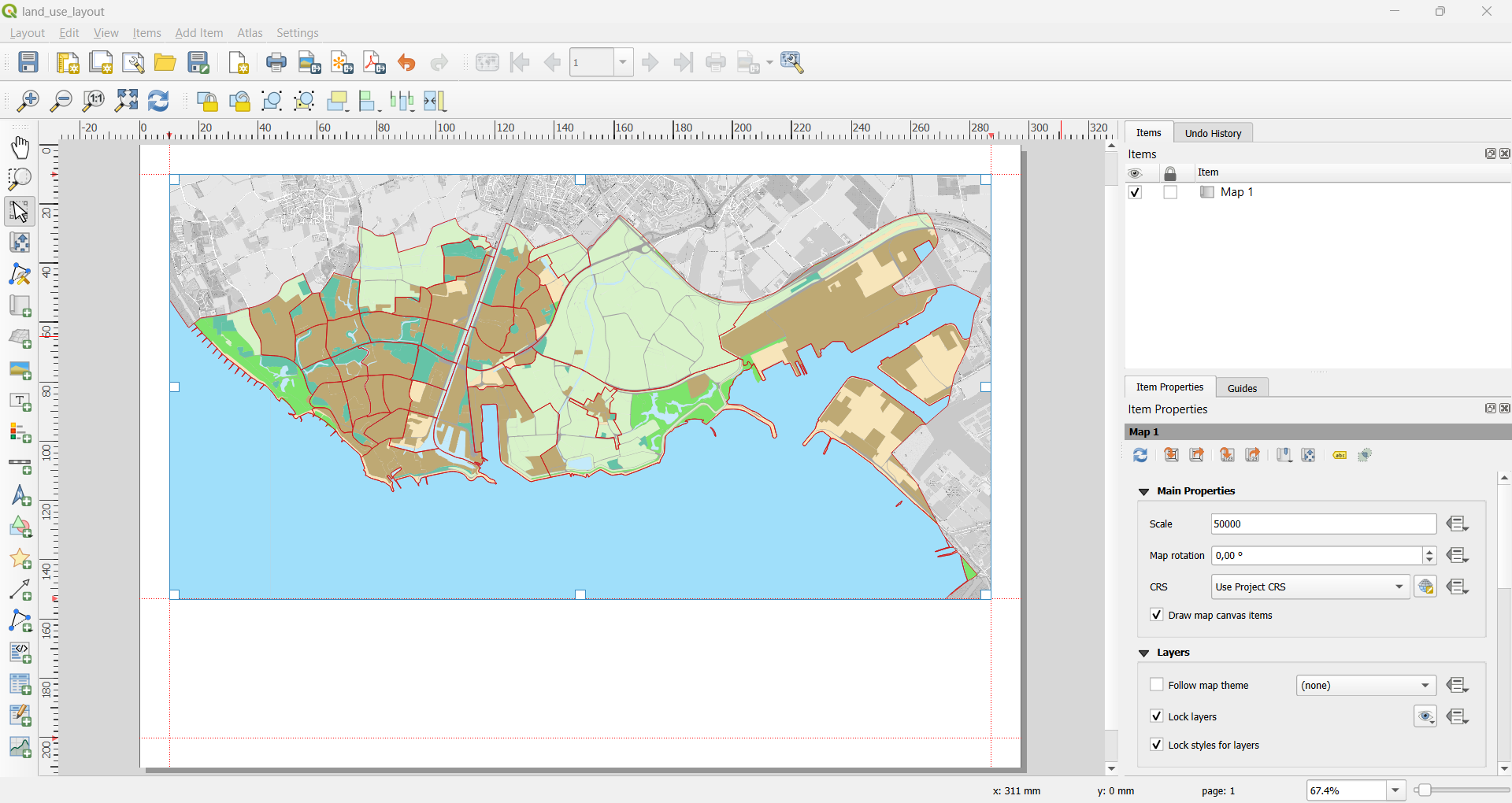
- Go to Project → New Print Layout, give it a name (e.g.
land_use_layout) - Click on the canvas; in Item Properties, change the page size to A3
- In the Items Panel, click Add Item → Add Map
- Click and drag on the layout canvas to draw the main map frame — aim for roughly 60–70% of the page
- With the map item selected, use the Item Properties panel to pan/zoom the map inside its frame until the extent looks right
- Once you’re happy with the extent, tick Lock Layers and Lock Styles in Item Properties, so later edits to the project don’t accidentally change what’s shown in the layout
Result: Your styled layer fills most of the page as the main map.
Step 3: Add an Inset (Locator) Map
A reader unfamiliar with Vlissingen needs context for where your main map sits — that’s what an inset map provides.
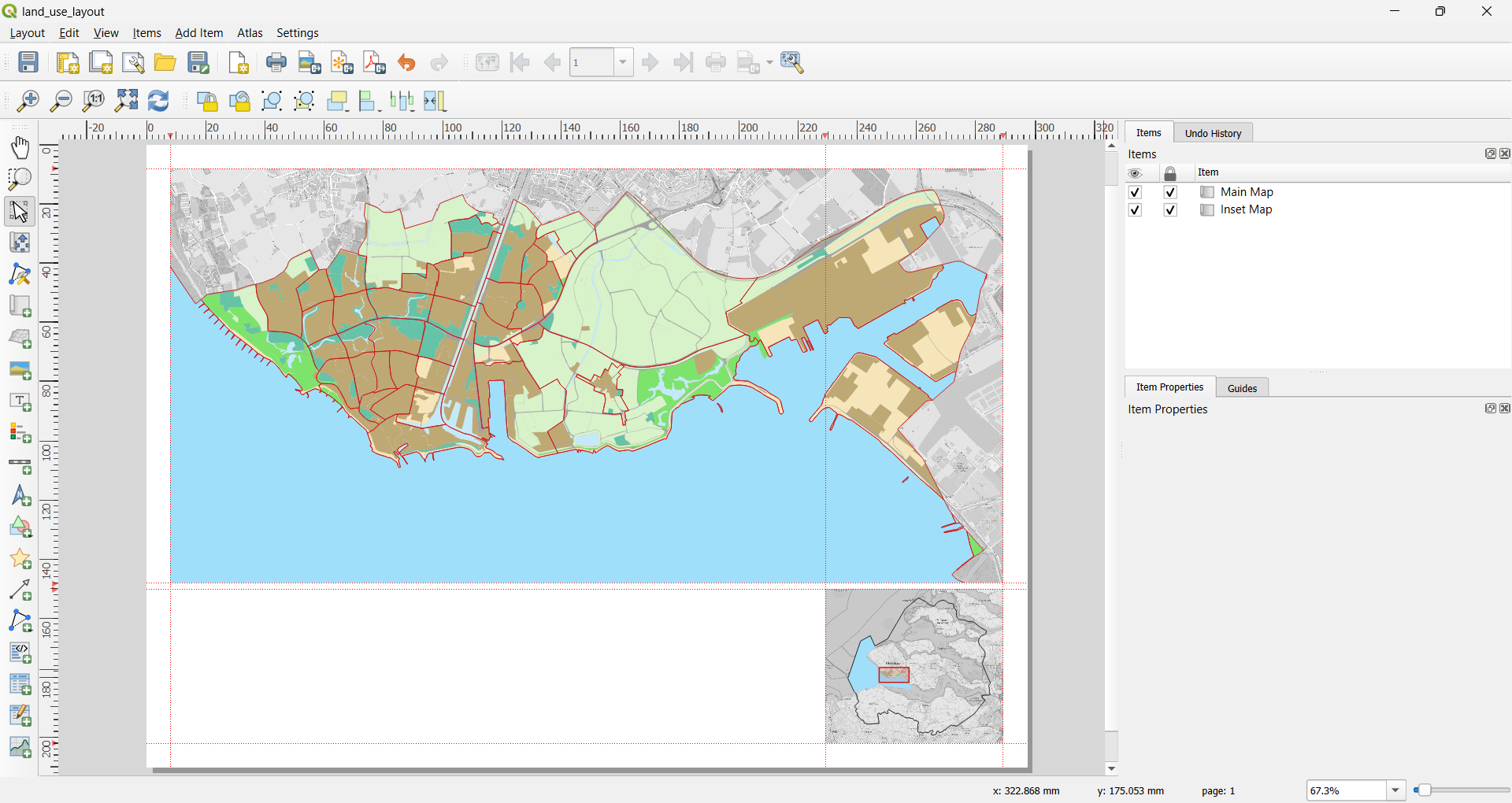
3.1 Add the Inset Map Frame
- Click Add Item → Add Map again
- Draw a small frame in an empty corner of the page (roughly 15–20% of the page width)
- In Item Properties for this new map, zoom/pan it out to show the wider context — i.e. Vlissingen’s location within Zeeland — using the
zeelandlayer
3.2 Show the Main Map’s Extent on the Inset
- With the inset map selected, open Item Properties → Overviews
- Click the + button to add an overview
- Set Map frame to your main map item
Result: A highlighted rectangle now appears on the inset map, showing exactly where the main map’s extent sits within the wider area.
Step 4: Add a Legend
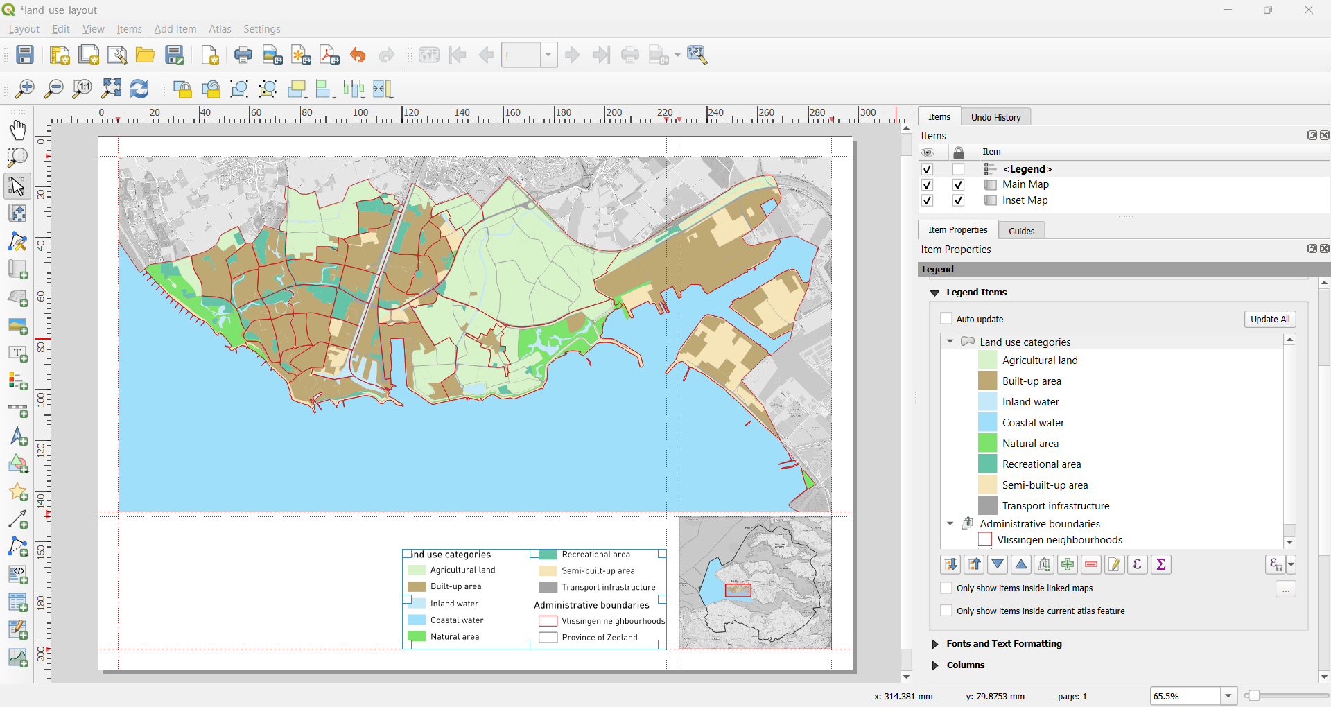
- Click Add Item → Add Legend
- Draw the legend box in a clear area that doesn’t overlap the main map’s content
- In Item Properties, uncheck Auto update so you can edit it manually
- Remove any layers from the legend that aren’t relevant to your map’s message (select the layer under Legend Items and click the − button)
- Double-click layer/class names to rename them into reader-friendly labels (e.g.
FSI_24→ “Floor-Space Index, 2024”)
Result: A clean legend that explains only what’s relevant to your map.
Step 5: Add Title, Description, North Arrow, and Scale Bar
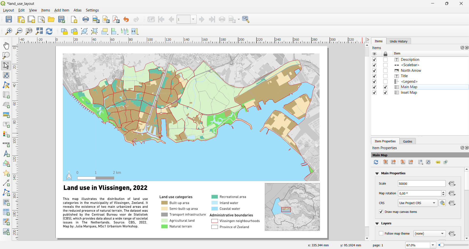
- Title: Add Item → Add Label, place it at the top of the page, and set the text to a short descriptive title (e.g. “Building Density (FSI) in Vlissingen, 2024”). Increase the font size so it reads clearly as the title
- Description/caption: Add a second, smaller label somewhere near the bottom of the page with a short caption — what the map shows, the data source, the date, and your name (e.g. “Source: RUDIFUN, 2024. Map by [Name], MSc1 Urbanism Workshop.”)
- North arrow: Add Item → Add North Arrow, place it in a corner that doesn’t compete with the inset map
- Scale bar: Add Item → Add Scale Bar, place it near the north arrow, and set its units (metres or kilometres) to something sensible for the map’s extent
Result: The page now has a title, a short description with source attribution, a north arrow, and a scale bar.
Step 6: Style Symbols for Clarity
Layout elements only work if the underlying map symbology is legible at print size.
- Return to the main map’s Layer Styling (
F7) if needed - Increase contrast between classes if colours look too similar once printed/exported (e.g. widen the colour ramp, or reduce the number of classes)
- For point layers (e.g. bus stops), check that marker size is large enough to see at the layout’s scale, but not so large that points overlap
- Keep any reference/basemap layers (e.g. OSM) subdued — lower opacity or greyscale — so your main theme stays the visual focus
- Click Apply, then return to the Print Layout and refresh the map item if changes don’t appear automatically (right-click the map item → Refresh View)
Step 7: Add and Style Labels
- Select the
vlissingen_neighbourhoodslayer, open Layer Properties → Labels - Change No labels to Single Labels
- Value:
buurtnaam - Under Text, set a legible font size (test at your layout’s scale, not the default canvas zoom)
- Under Buffer, enable a white (or light) halo around the text, so labels stay readable over coloured polygons
- Under Placement, choose a rule appropriate to your geometry (e.g. Around Point for point layers, or a polygon placement mode that centres the label in each polygon)
- Click Apply, then check the layout for overlapping or clipped labels — reduce font size or manually move individual label positions if needed (Move Label tool in the layout toolbar)
Result: Key features are labelled directly on the map, legible against the underlying colours.
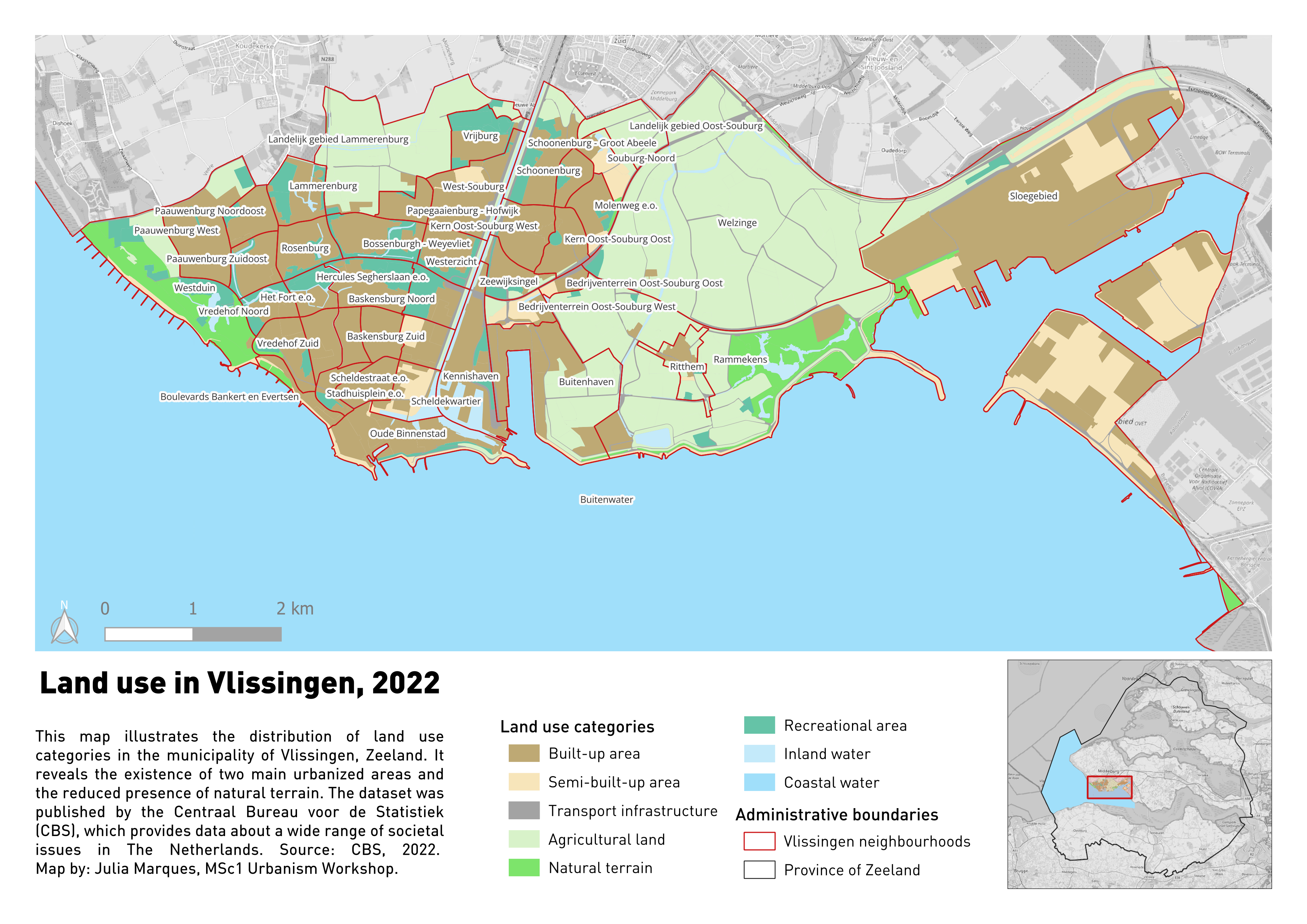
Extra: Rule-based Labeling
- Select the
vlissingen_neighbourhoodslayer, open Layer Properties → Labels - Change Single Labels to Rule-based Labeling, click Add Rule
- Filter:
"aantalInwoners" > 1000"aantalInwoners"– refers to one of the layer’s attributes (number of residents)> 1000– flags neighborhoods with over a thousand residents
- Text:
buurtnaam - Style the labels as described in Step 7
Step 8: Final Check and Export
Before exporting, run through this checklist:
- Go to Layout → Export as Image… (PNG, for Miro)
- Save the export at a resolution suitable for on-screen viewing (300 dpi is a safe default)
- Upload the exported map to the course Miro board
- File → Save Project, so your layout is preserved
Take-Home
Repeat Steps 1–8 for at least one more of your Parts 1–4 outputs, using the same workflow, so that all four maps (land use, DTM/risk zone, choropleth, bakery density) end up as finished layouts by the take-home deadline.
Reflection
- Which single element (inset map, legend cleanup, labels, symbol styling) made the biggest difference to how readable your map is?
- How did adding the inset map change how a reader unfamiliar with Vlissingen would understand your main map?
- What trade-offs did you make between showing detail and keeping the map uncluttered?